App Design
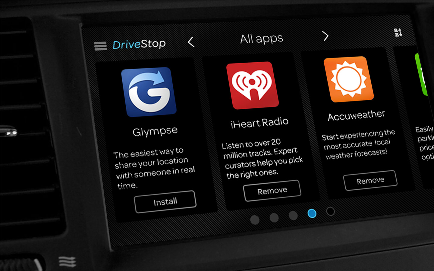
AT&T Drive
Design Lead, Android, UI/UX Design, Art Direction, Motion Design, Visual Design, Iconography, Illustrations
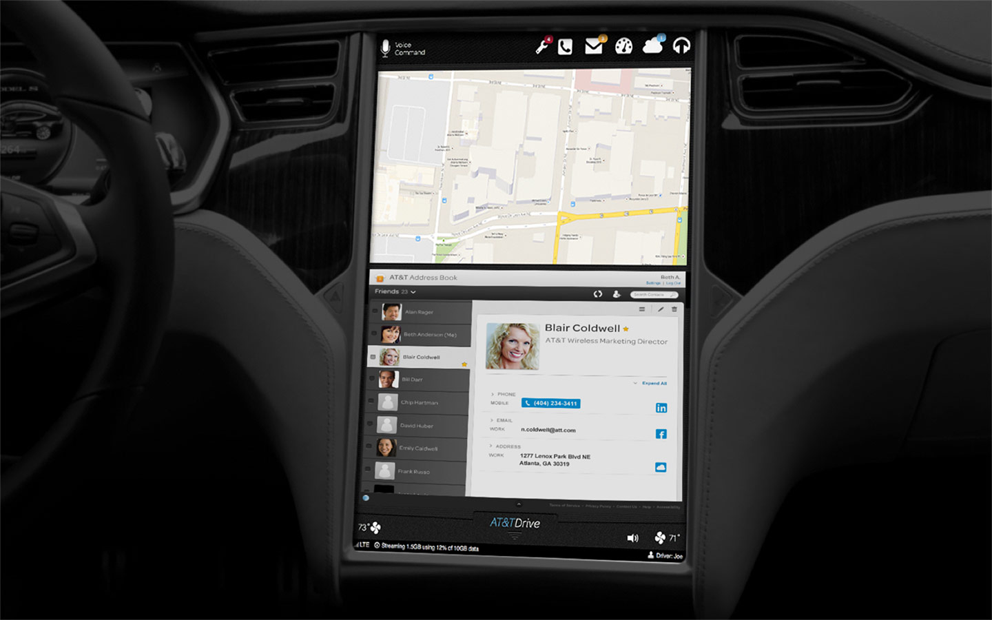
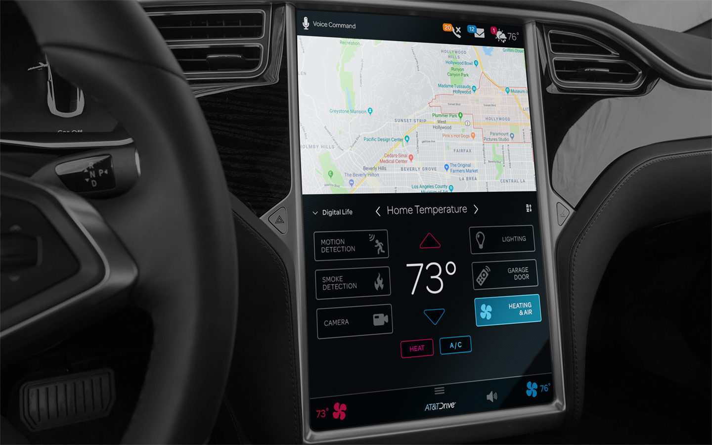
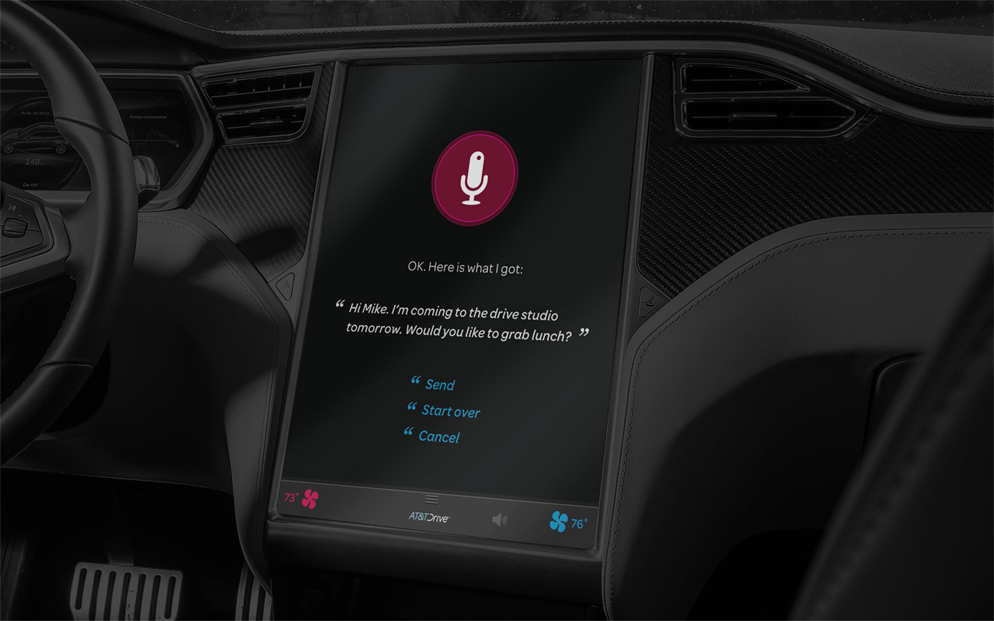
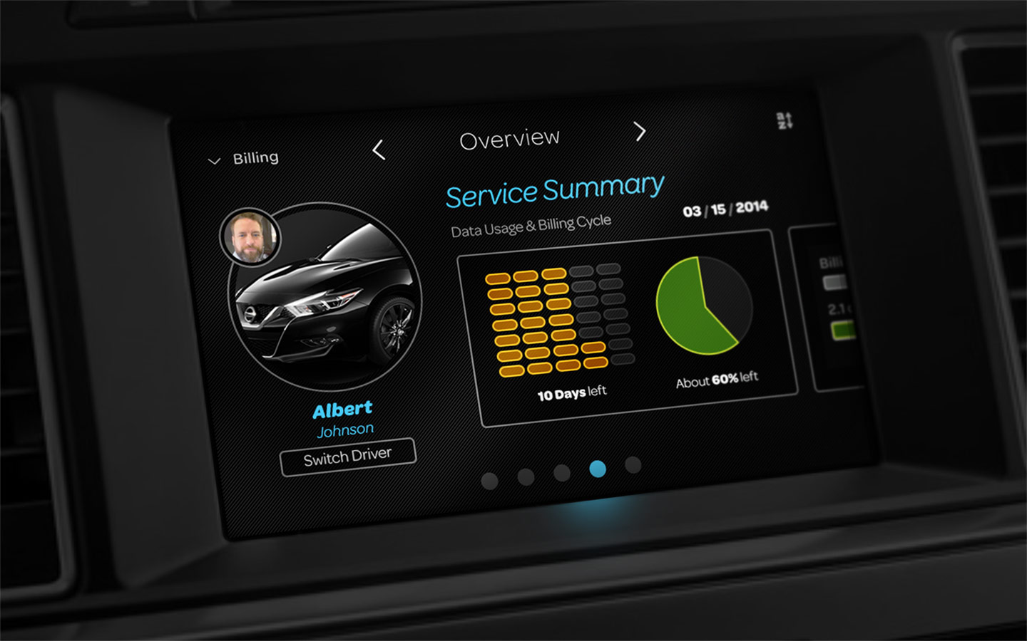
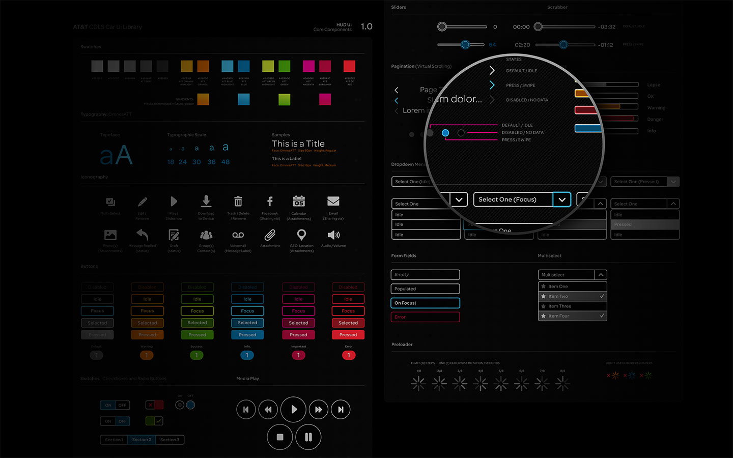
Project Detail: Create a visual language, guidelines and specifications document, and app layouts for the default customer experience of the AT&T Drive platform to engineers and app developpers from within AT&T and third party sponsors.
Tasked to lead the visual design directions and define the visual design language for AT&T’s first innovative connected car platform, an iPad size in-vehicule display panel positioned between the driver and the front seat passenger.
Mandatory design compliance dictated the general artistic direction.
- AT&T’s brand alignment
- AT&T’s Consumer Design Language System (CDLS) and
- The “NHTSA Driver Distraction Guidelines for In-Vehicle Electronic Devices” provided by the Department of Transportation (DOT) agency.
The visual design had to make room for other brands to co-exists within the platform, feel natural.
Based on the “NHTSA Driver Distraction Guidelines for In-Vehicle Electronic Devices” and user surveys conducted during the early stages of the project, research showed us the attention span for drivers is well under 0.5 seconds. Various light conditions (day/night, dusk and dawn) have a direct impact on the visual design elements. Quick scan-ability of the interface and muted visuals were at the forefront of the design decisions.
