UI/UX Design, Art Direction, Motion Design
Project Scope
Increase runner’s awareness of upcoming events. The client required to create one destination for both races taking place in separate cities, at the same time, on different timezones. Provide visitors with accessible content and exceptional experience by following closely the web accessibility standards aiming to conform 2.0 Level A + AA criteria.
Solution
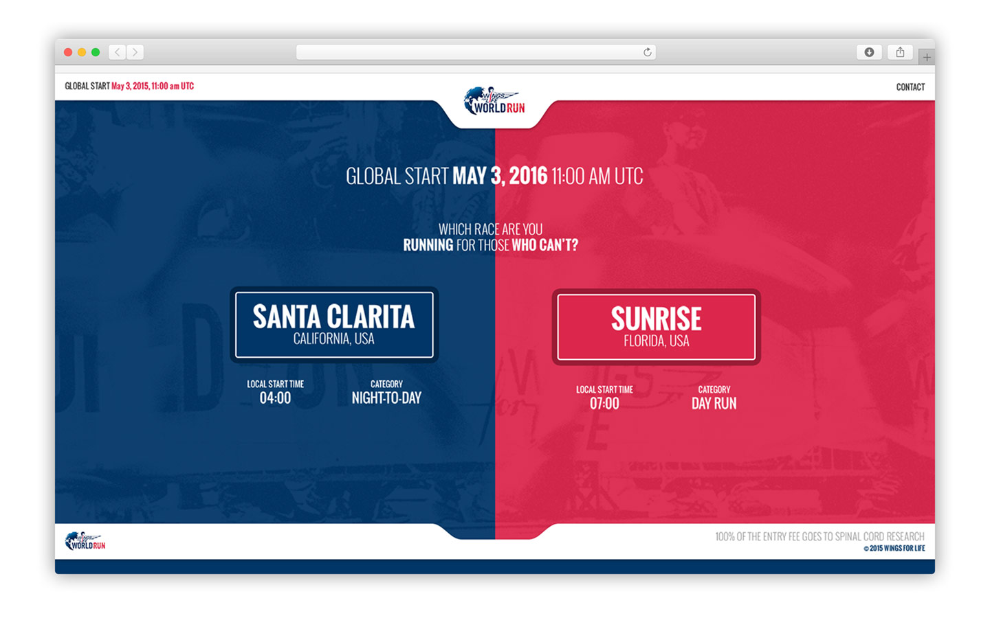
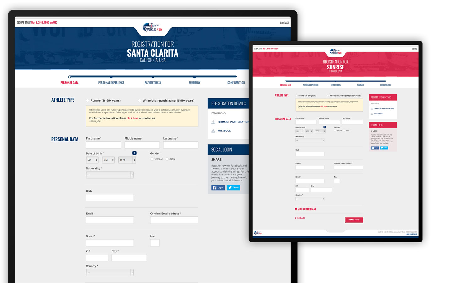
Create a landing page showing participating cities leading to the sign-up page, allowing participants to register. By combining the two events under one landing page, the marketing manager can target a single URL for the campaigns, while the dev team reduces the cost of development and maintenance by 50%.
Using a vertical split layout to represent the west coast city on the left, and east coast on the right, help the visitors to make a visual connection and select which race would be more convenient based-on their locations.
My Contribution
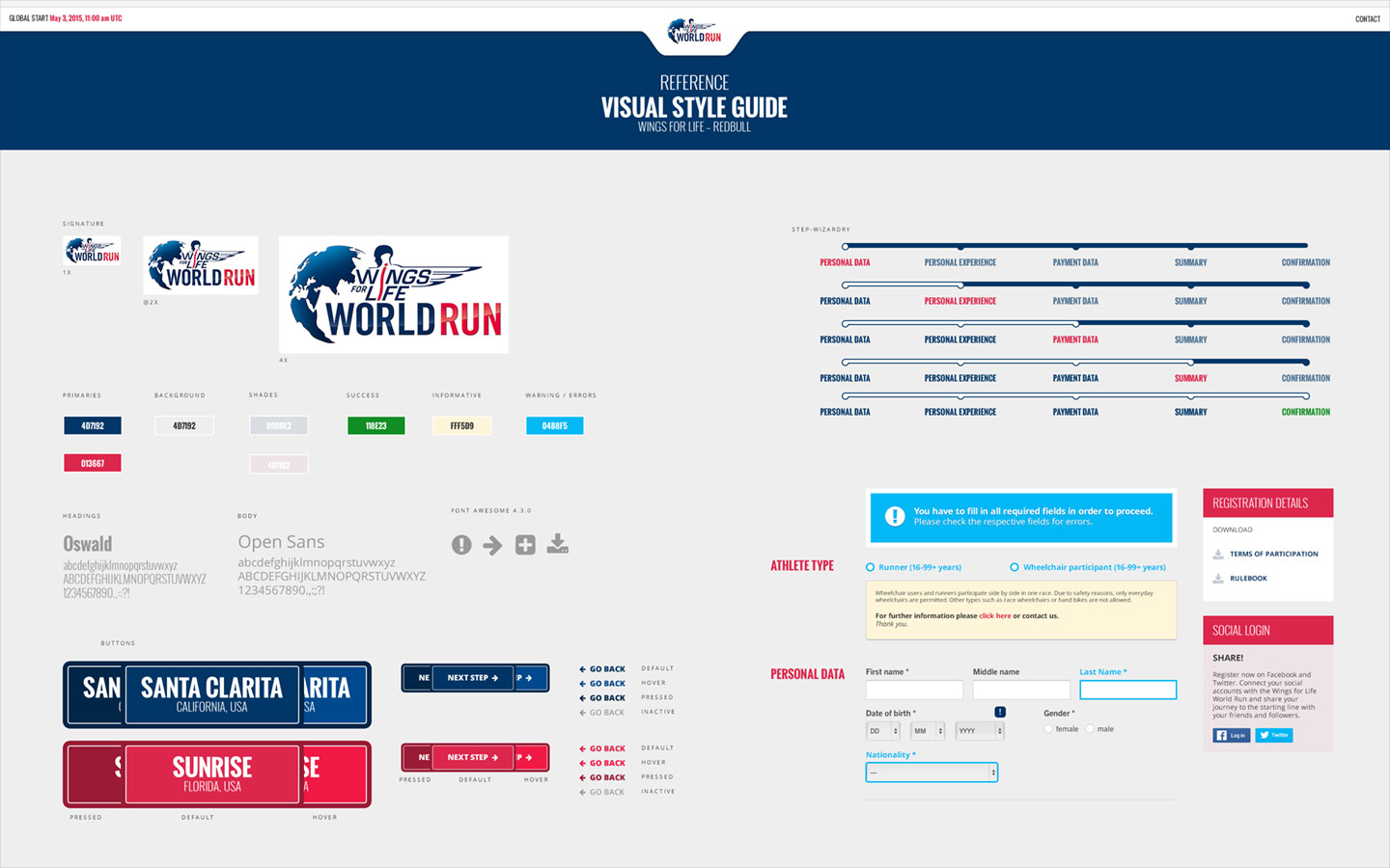
Guided by the brand specifications, I was able to create a visual design aligned with the product and marketing strategies. Collaborating with the client, we successfully tested multiple iterations ensuring the site's usability and accessibility compliance. I also provided a visual style guide for the dev team to reference during the design implementation.
Directly sampling from the brand color palette, I use the dark blue to communicate the race would take place during the night, while the red color showcased a day run. Adding clarity and distinction between the two cities.


Thank you for reviewing my work, please contact me if you any questions or comments. More projects will be available soon, be sure to check back in a few days. Until then, have a great day.