FINSYNC
Product Marketing Website
Scope
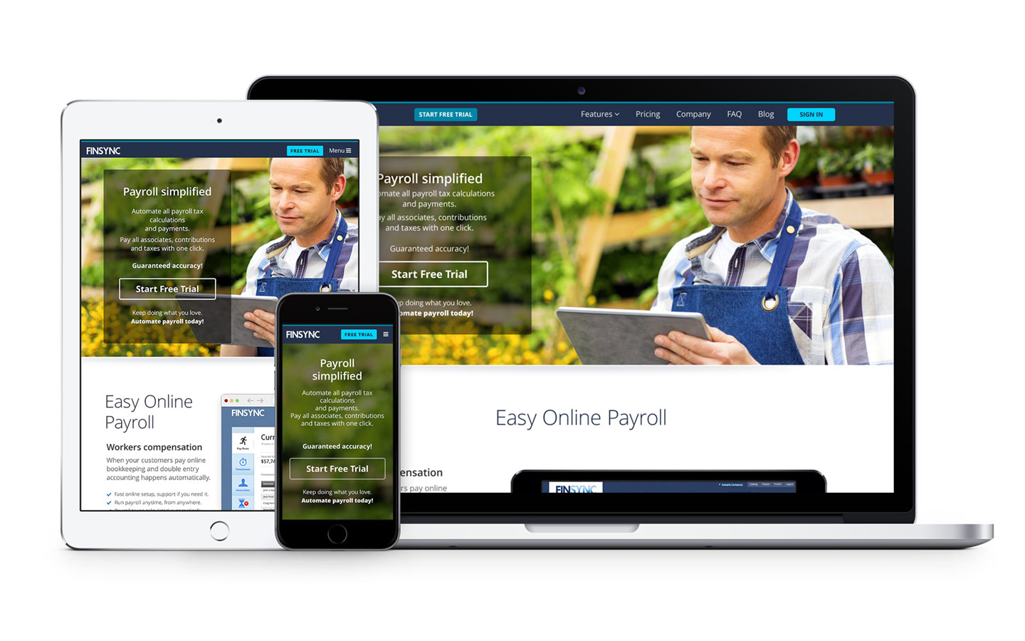
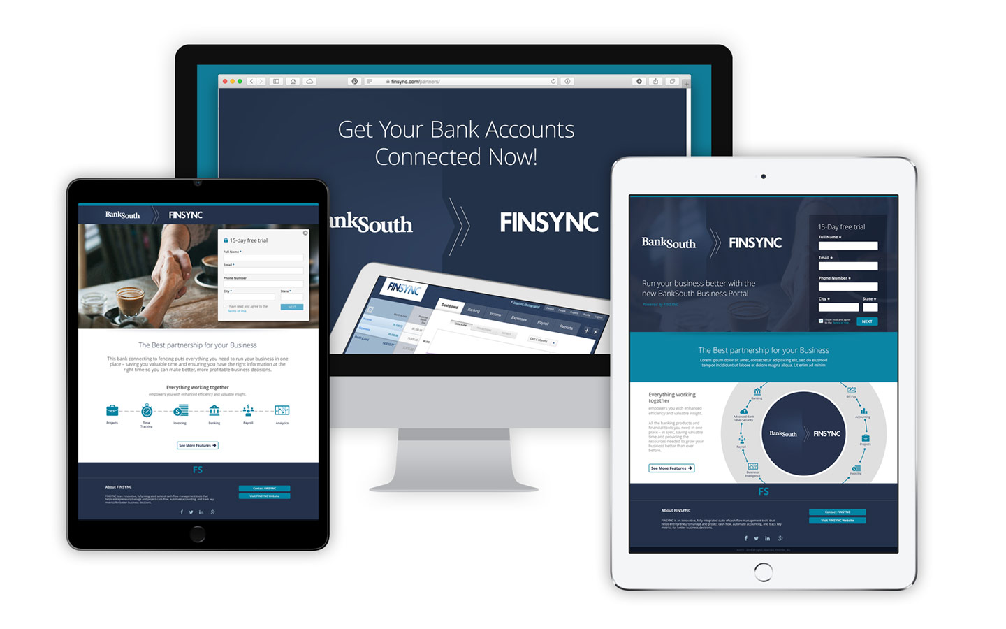
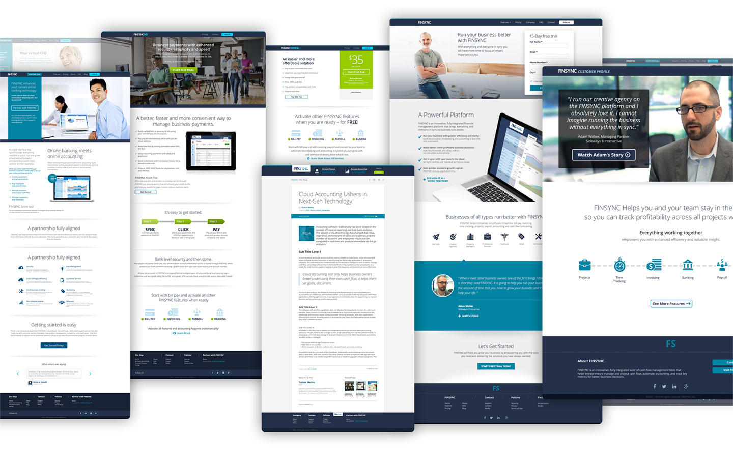
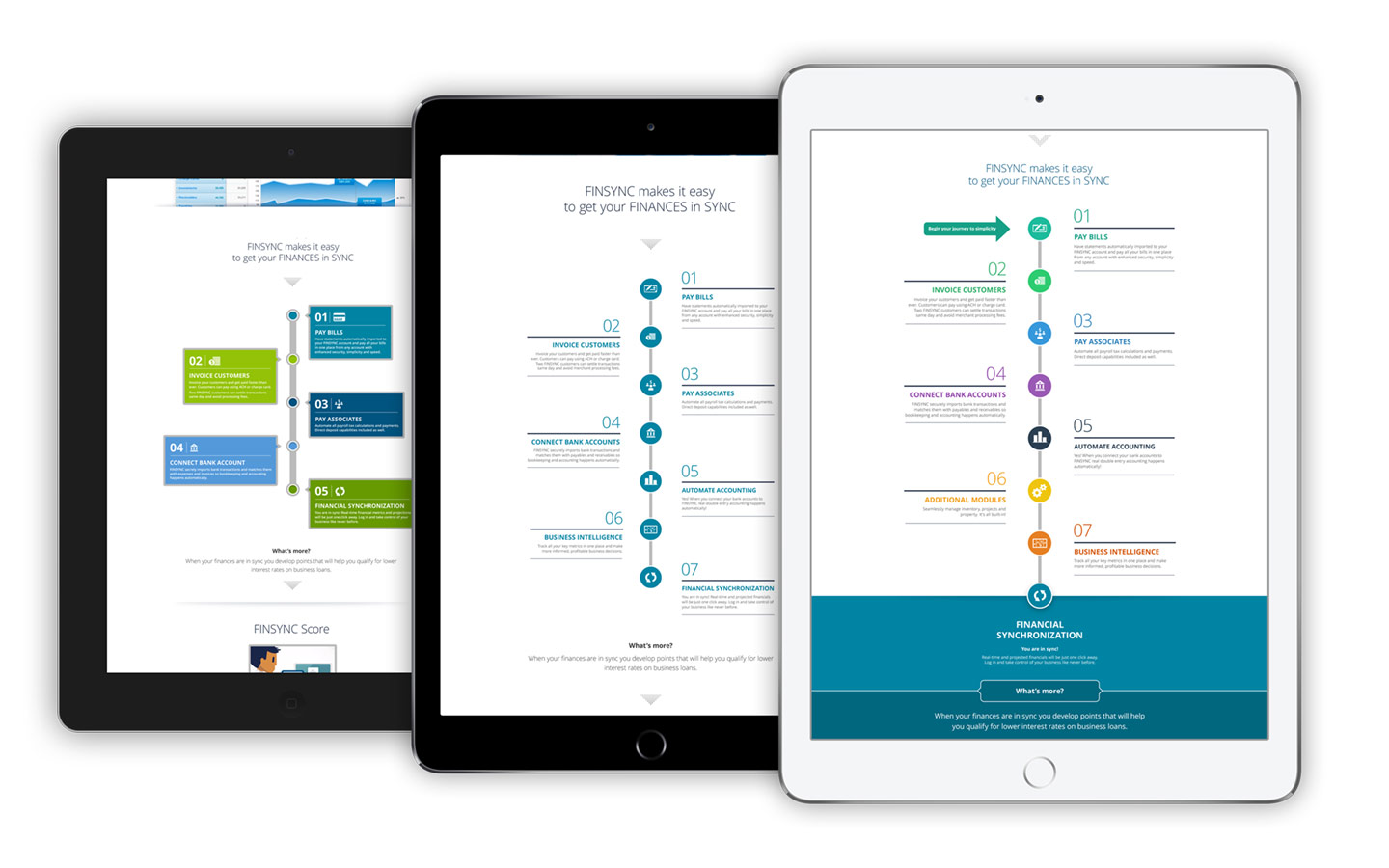
Re-imagine and redesign the marketing website for FINSYNC, an app that helps businesses by providing enhanced analytics and quicker access to capital, to raise awareness of newly implemented features for prospect users and existing customers.
My Contribution
I was first brought in as a web designer to redesign a landing page in dire need of design guidance, basic typographical contrast, hierarchical structure, and information architecture. The team was so happy with my work that I was quickly promoted to the role of creative director. In that role, I was in charge of the visual design of the entire website. I also worked closely with various departments, bridging the communication gap between the client and the development team.
Design Rationale
I created a unique user-focused approach based on user feedback while gathering data from online A/-B testing results.
The new design conveyed a more approachable experience, highly influenced by the new photography used on each page. Photos included people working in the context of small businesses. Customers were able to connect with the images and conversions on the website increase with each design iteration.


